Mark Bradford’s Social Fabric

The art of south central L.A. artist Mark Bradford was nurtured in the protective environment of his mother’s hair salon where he began to make collaged “paintings” out of the end papers that his mother used to give perms to her clients. Since then he has gone on to create work distinguished by his use of found materials, particularly paper, instead of paint. Working with the cultural by-products, the detritus, of contemporary society, Bradford layers, sculpts, and excavates his materials into beautiful, formally stirring works that also speak of, and literally through, the “social fabric” of our times.

Screen Shot 2020-03-07 at 1.06.42 PM.png

Mark Bradford’s Layered Urban Art

Leave a comment

Filed under Materials, Practice, Process

“What is Art Actually For?”

Artist, musician, composer, writer, record producer Brian Eno of the 70’s band, Roxy Music, unwinds a fascinating discussion on the topic, “What is art really for?” Beginning with the enigmatic proposition that art is “everything you don’t HAVE to do,” Eno captures the dynamic tension between our culture’s ethos of technical control, which dominates education and academia, and the arts, which explore the shadowy dimensions of “What if.”

Born in Suffolk, Eno studied painting and experimental music at art school in the late 1960s before joining glam rock group Roxy Music as synthesizer player in 1971. After recording two albums with the band, he departed in 1973 to record a number of solo albums, contributing to and ultimately coining the concept of ambient music with works such as Another Green World (1975), Discreet Music (1975), and Music for Airports (1978). He took part in frequent collaborations with artists such as Robert Fripp, Harold Budd, Cluster, David Bowie on his “Berlin Trilogy“, and David Byrne on 1981’s My Life in the Bush of Ghosts. During the 1970s, Eno would also begin a parallel career as a producer, which included work on albums by Talking Heads and Devo, the no wave compilation No New York (1978), and recordings by avant-garde artists such as John Cale, Jon Hassell, Laraaji, and Harold Budd, among others.  -from Wikipedia

Leave a comment

Filed under Theory

The Unplayable Piano

“..all of us, from time to time, need to sit down and try and play the unplayable piano.” -Tim Hartford

On the long flight home from Rome this summer I found myself watching TED Talks on the aircraft’s entertainment system. Already thinking about the beginning of a new semester, one talk in particular caught my attention. Tim Hartford, an economist and journalist, gave a brilliant talk about frustration and how it can actually help us overcome obstacles and discover unforeseen possibilities in any creative process, whether it’s the design of a jet engine, the design of a musical composition, or the creation of a work of art. Weaving in examples from cognitive and social psychology, complexity science, and rock and roll, Hartford’s bottom line is simple. What we need in order to tap our highest creative potential is, in his words, “a dash of mess.”

Listen to the full Koln Concert of Keith Jarrett

Brian Eno’s Oblique Strategies

David Bowie’s “Lodger” album (1979)

Carlos Alomar (Bowie’s guitarist, discusses working with Bowie, inspiration and motivation)

Leave a comment

Filed under Process, Theory

The Golden Key

Leave a comment

Filed under Uncategorized

Working With the Given: Student Responses

IMG_1315

Originating in a discussion of Marcel Duchamp’s “ready-mades,” and taking inspiration from Alberto Burri and the Arte Povera movement in Italy, students foraged for found materials to provide a palette of possibilities for original designs.

The main problem inherent in working with “junk” is achieving a unity that somehow transcends the humble origin of its means. In other words, how do you make something that doesn’t look like a bunch of trash stuck to a background? Avoiding the “scrapbook effect” is paramount. The most successful solutions are those that manage to activate the ground, drawing it into the overall design so that it participates in the whole, even to the point of asserting a prominence that vies with the more obvious figural elements. In many cases the solution presents itself by adjusting the proportion of the ground, cutting it down to find the right balance with the materials, which is really just a way of enlarging the elements within the design. In other cases, designs cluttered with too many bits and pieces are improved by simplifying, allowing a few extraordinary forms, colors, or textures to breath and resonate.

Working with found material is a brilliant way to explore an alternative modality in design. Beginning artists often conceive of the process of designing as starting with an idea and working in stages to realize it. What many students come to appreciate is that the process of design can be as much a matter of finding a certain rightness, a logic, as it were, inherent in the materials and in their various relationships as we play with possibilities. It’s a bit like starting a fire with wet wood, trying to ignite a spark that continues to build. When it works, the results can be an epiphany. The often striking impact of the best pieces borders on the miraculous, not less so because of the sheer improbability of finding beauty in what most people regard as trash.

Leave a comment

Filed under Materials, Process, Student Work

Shifting Ground

Figure-Ground Metamorphosis 
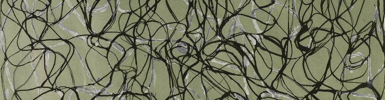
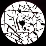
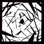
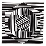
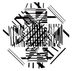
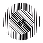
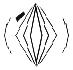
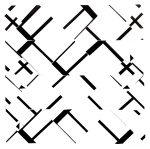
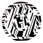
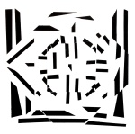
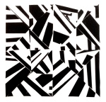
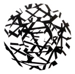
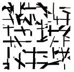
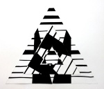
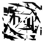
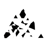
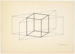
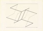
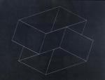
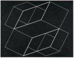
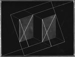
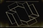
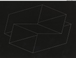
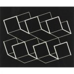
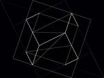
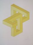
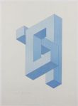
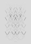
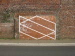
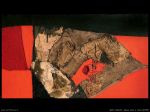
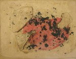
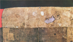
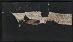
Spatial perception is a continuous, cognitive process of inferring three-dimensional sense from the constantly shifting pattern of retinal sensation in which we are daily immersed. For everyone except visual artists the process is almost completely unconscious; something we have picked up from birth, along with our native language. The central mission of the visual sense is to identify “things” and distinguish them from the empty space that surrounds them. Graham Collier, in his book, Form, Space & Vision states, “…to perceive space… there must be a figure on a ground. For then a visual tension is created between the physical presence of something that intrudes, and the… apparent emptiness which surrounds it…” Naturally people take more interest in actual things than they do in empty space, but for an artist this isn’t necessarily so. Over time, engagement with the two-dimensional language of art trains the artist to be acutely aware of both object and space as two co-equal entities. 2D Design students at OWU, working with one of Collier’s classic exercises, beautifully demonstrate the co-dependence of figure and ground and the capacity of each one to shift or reverse.

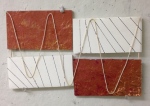
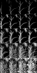
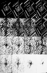
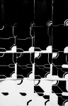
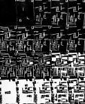
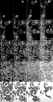
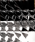
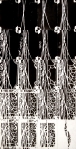
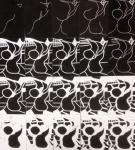
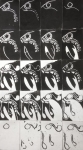
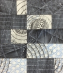
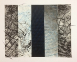
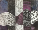
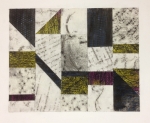
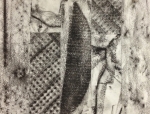
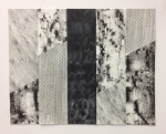
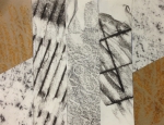
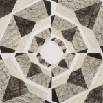
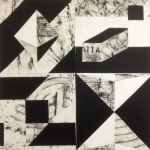
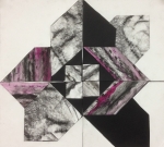
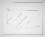
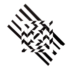
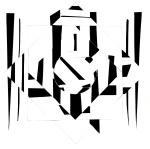
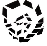
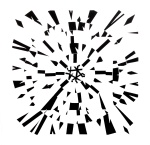
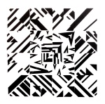
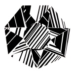
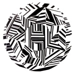
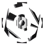
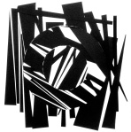
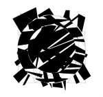
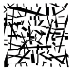
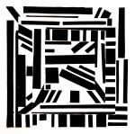
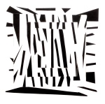
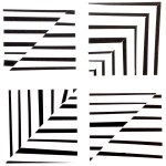
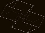
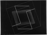
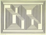
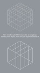
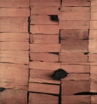
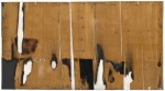
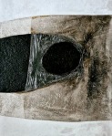
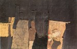
Students employed the subtractive process of block printing to create a sequence of individual rectangular designs that, together, configure a larger rectangle. The unifying element of repetition works to break down the perception of each print’s individual design, and the recognition of metamorphic change propels the eye forward. The  whole enterprise is fraught with instructive ironies regarding the nature of figure-ground interactions. First, the initial figure is produced by an absence – removing the solid material of the block with a cutter – but in the print it appears as a presence, a white figure on a dark ground. The white mark reads unequivocally as figure due to the relative smallness of its area with respect to the larger black rectangle, and also because our eye can surround it. After each printing, students “add” another mark, or several marks, before printing again. Some students worked out their cuts in advance from a master plan while others, like jazz musicians, improvised by responding intuitively to the developing image. In the process of subtraction marks are added to the design.  Somewhere along the march of progress an interesting thing happens. First, the ratio of white figure elements to black ground equalizes. Figure and ground become ambiguous and interchangeable. Then, as cutting continues, the figure-ground relationship reverses. The black ground has become the figure and the white has become the ground. The total design consists of twenty stages arranged in a flowing pattern from left to right and top to bottom. Students are challenged to select the states from 30 to 40 printings  that best create an integrated whole with smooth transitions and without abrupt changes that interrupt the flow or that create undue emphasis.

Leave a comment

Filed under Practice, Process, Student Work, Theory

The Art of Space / The Space of Art

Leave a comment

Filed under Uncategorized

Frottage: Student Response

The senses of sight and touch are strongly linked. Tactility in art adds another level of impact to the more obvious formal elements of shape, line, and color. Texture can be both actual and visual, the first being a factor of the materials used, and the latter generated by the mark-making of the artist. Students in this project investigated texture as a design element using “frottage,” a strategy first developed by the Surrealists, to lift textures from the world around them. A period of foraging for textures armed with an array of different media and papers was followed by designing with the raw materials of found textures. In the designs below students worked within the constraints of two different design constructs. A columnar structure defines the first problem. Students selected textural elements by cropping and experimenting with various arrangements with the goal of breaking down the taxonomic effect of the columns. In the best designs similarity groupings and continuities lead the eye across the borders, configuring larger patterns of movement within the whole. Contrasts provide  forces of variety, emphasis, and visual weight that organize to produce a balanced, integrated and dynamic whole. The second design was developed from a previous problem involving isometric forms. The final design is a large square composed of four smaller squares, each of which contains an isometric figure translated into three values, black, white, and a middle-value consisting of the optical gray of the frottage elements.

Leave a comment

Filed under Materials, Practice, Process, Student Work

Isometrics for Artists: Student Response

Isometric projection is a simple form of perspective used by artists, architects, and engineers to show depth or dimension without the apparent distortions that form undergoes as it recedes in space. Isometric perspective employs parallel lines that never vary from the parallel, unlike linear perspective in which parallel lines appear to converge toward a common vanishing point. In isometric projection there is no convergence and no vanishing points. Josef Albers, an important 20th century artist, designer, teacher and color theorist, created a large number of works that employed the design construct of the grid and isometric projection, which he called “Structural Contellations.” In this project, students were challenged to engage with the same tools and limitations: the grid structure and parallel line inventions.

Leave a comment

Filed under Student Work

Broken Symmetries

In this problem students created symmetrical designs based on concentric forms. Introducing the element of line, and allowing for variables of thickness and direction, students sought to establish a tension between the static nature of the initial symmetrical construct and the dynamic variability of the line play. The symmetry of the original design structure allows for rotation, or interchangeability of component elements, introducing new potentialities for increasing complexity. The principle of continuity, or closure, generates new implied shapes, activating the ground as the eye connects the fragmented dark figures. The natural desire of students to control outcomes through drawing and planning eventually gave way to unique and very instinctual responses to the unforeseen visual energies that are produced by the interaction of the elements.

Leave a comment

Filed under Practice, Process

Isometrics For Artists

Leave a comment

January 13, 2014 · 4:33 pm

Working With the Given: Alberto Burri, 1915-1995

The life work of Alberto Burri was born in an American POW camp in Gainesville, Texas, where he was interned after the capture of his unit by the Allied forces in Tunisia in 1944. Defeated and confined in a strange land Burri turned his hand to making art out of the common materials that were available to him. The discarded burlap potato sacks from the kitchen with their subtle variations of color, repetitive linear weave and texture, were a rich source of visual matter for him.  Returning to Italy after the war Burri continued fashioning compositions from burlap and other found materials. The revival of Italy’s post-war economy gave Burri a new palette of industrial materials to work with. Plaster, discarded metal, plastic sheeting and common building supplies presented to his imagination unique physical qualities from which he created works of astonishing beauty.

The impact of Burri’s work goes beyond the visual. It appeals to a sense of play that perhaps is more common in children with their innocence about the prescribed meaning of things. In Burri’s hands plastic, burlap, and scraps of wood and metal vie with the most sublime subjects of art. Like a crazy and inappropriate uncle who is not above making a broom become a horse for the delight of children, Burri charges extraordinarily ordinary utilitarian materials with an esthetic power that is completely contrary to their original intentions and purposes. That’s his great lesson and example to us all.

Read more:

Alberto Burri bio

Arte Povera

1 Comment

Filed under Materials, Process

The Space of Play

More on the relationship of art to play, thanks to artist Julie Heyward, from her blog, Unreal Nature:

From A Philosophy of Sport by Steven Connor (2011):

… The space of play is carefully patrolled, to the millimetre. For there can be no mind-space, no space between secular space and the space of play. Either the ball has wholly crossed the line, and it is a goal, or it has not, and play will continue from where it left off. If a lace from the cricket fielder’s boot is in contact with the boundary rope when he takes the lofted catch, it will be four runs; if not, the batsman is dismissed. If the ball is deemed to have clipped the line — betrayed by the puff of chalk or detected by the automatic sensor — there may be a new grand slam champion; if it misses, the player’s chance may have receded forever. In this sense at least, in its implacable abhorrence of the middle way, its intolerance of any tertium quid, there seems to be no room for play in the space of play.

… The stadium effects the opening, the admission without access, to this arbitrary and absolute space of irrevocable arbitrations. In play: that is to say, in crisis.

Yet it is for precisely this reason that the crisis of play runs quietly and cleanly through the middle of it, that, in the space of play, space is neither given nor fixed. Instead, it is absolutely in play, which is to say, the subject of continuous contention.

… In thinking of the space of play, we will repeatedly have to cope with the following contortion. The space of play is set off, by an act of pure decision, by the simple decision to mark out a space in which to decide the matter. In this space of play, space is decidedly in play, in a way that it is not in spaces not so marked off.

Leave a comment

Filed under Theory

Color and Space: Sonia Delaunay

Color Moves: Art and Fashion by Sonia Delaunay, Cooper-Hewitt Museum

Sonia Delaunay

Leave a comment

Filed under Practice, Research

Color and Space: Louisa Matthiasdottir

Louisa Matthiasdottir

Leave a comment

Filed under Practice, Research